|
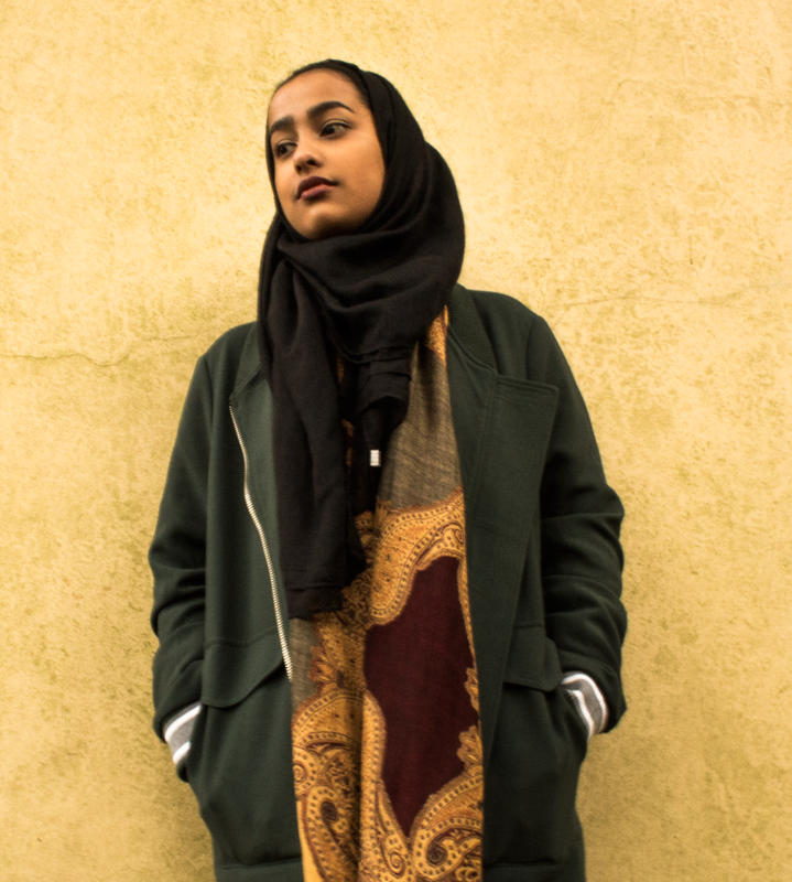
Fashion photography is used to promote clothes for a company in order to represent the professional quality of the brand and therefore boost sales. After we took the photos I edited the colour on some of them on photoshop to bring them to life a bit more, in order to make them stand out more. To do this I needed to focus on the pose of the model, with my desire for the model to look visually appealing. The clothes will need to be specifically chosen in order for my model to be an important aspect in the photographs. The first image is f/6.6, 200 ISO 400, f/3, ISO 600 and f/4.5, ISO 500. The first photo was taken down an alleyway in Ashton-Under-Lyne, the second photo was taken outside of the college and the third was taken in Hyde. We all took it in turns when using the camera as we worked in a group and only had one camera. We all had opportunitunies to take photos, the relationship between me and the photographers (not including myself) is that we are all best friends so we are very close as we see each other daily. We aimed for dramatic poses and to our advantage it wasn't raining so the camera wasn't at risk of getting damaged. The weather was sunny and therefore bright so was managed to use natural lighting to our advantage. The last photo was taken indoors so the natrual lighting coming through the window was used to its advantage as well as using ISO more lighting to the ambient light present, the flash was also used to add even more light to give the photo the effect that we wanted. When the lights was switched on inside the house we found it created a slight orange look which made thr photo appear too warm hence why we decided to switch them off for this particular photo. These photos make me feel a sense of calm and ellgantness as they are bright and appealing to look at. These photos are minimulistic as the backgrounds dont have any distractions in them since not a lot is going on in them, therefore simplistic. Facial expressions are pretty much nutrual, especially in the first two, this is so there are no baised attitudes towards the clothes.
0 Comments
Marco photography is a close-up/zoomed in photo of a certain thing. I took a photo of a dandelion showing off the vibrant colours of the flower head and leaves. It has a low depth of field therefore giving the image bokeh. I wanted this effect so all the attention is on the flower so there is no distraction in the background. The rest of the image besides the flower is irrelevant, It makes the flower pop and comes to life. The vibrant and lively colours behind the main component allow the flower to blend in with its surroundings, contributing to a more pure and natural setting. This is effective in terms of the lighting as the original mood created by the flower is enhanced, as it increases the impressions of peace and emphasises its solitude within the scene.  The structure of the briefs tend to be different each time, you need to make sure its laid out correctly so it is therefore easy for the viewer to understand and interpret. As well as this, the ideas must be put together in order to form a completed set of developed and finished tasks, ideally to aspire to the audience. You have to remember to include all the necessary information such as possible questions. This therefore helps to engage the viewer, forming a relationship with the desired audience. This as a result helps to leave an impression on the viewer, which could potentially inspire them to share the ideas with other people. When reading someone else's brief, you have to be able to identify what is being done. This is done through the use of images and text that link to the brief.
When reading a brief you need to take in account everything that is included it is for you to follow and carry out is required. An example of this would be a brief for a website, if you don’t follow it or misread information then it won’t go to plan, therefore wont fulfil your desire and requirements. My friend took a few shots of me throwings leaves in the air to demostrate fast shutter speed. As you can see, the quality of the photo is sharp, therefore you can see lots of detail. Those photos have quite a warm feeling about them due to the natrual lighting. I love how the sunlight streams through the leaves which brings the colours in the autumn leaves alive. We did some light photography due class using a slow shutter speed, the people were making different patterns to create these different effects, some using torches and some others were christmas lights. This was a case of trial and error because we have never done light paining before so it took a few attempts to get the effects that we wanted. As a result, despite a lack of experience in this certain field of photography, we aimed on creating light pictures that displayed an energetic mood. To do this, we focused on forming complex shapes with the lighting, creating a very lively and busy impression in the scene. In order to improve the diversity of the different photographs, we focused on making each one as unique as possible, caused mainly be the different colours and shapes that we were able to create. The first image (Coloured lightning) is my favourite because the different conventions that are shown all work together within the scene. The wide range of colours that are used show the energy that is created by what looks like bolts of lighting, creating a very diverse image. All throughout taking and editing my photos I tried to show a wide range of skills despite it not being my strongest area of media. I took 100 photos on a Canon EOS 600D (DSLR camera) and edited my favourite landscape 5 photos in Adobe Photoshop CC. Strength of mine was I could easily think of ideas when it came to thinking of what images to take. I made sure I kept to my proposal and brief and therefore made sure all the photos taken were urban landscapes. Landscape photography is a scenic/establishing shot taken in landscape rather than portrait, which could be anything from urban city life to the rolling hills of the countryside. Photography techniques used during these types of shots for example low and high aperture to give the photo a different atmosphere. I went to Manchester to take some urban landscape photos in order to promote the city. I set the camera to manual and experimented with different camera settings to give the photos different effects. We visited Manchester on Sunday 11th December, in order to take a wide range of urban photographs, with the aim in mind to take 100. Within the city, we visited many of the diverse locations in which I had originally desired to visit. Places we visited included Manchester Town Hall, The Urbis, The Christmas Markets, Old Trafford Football Stadium and Piccadilly Gardens. This allowed me to take a range of photographs that demonstrate the diversity and muti-cultural areas of the city. Modern aspects include the Football stadium and The Urbis, in contrast to the older developments, which include the Town Hall. We took hundreds of photos; I choose my favourite five and edited them in Photoshop. I managed to stick to the proposal since I had a lot of time and no transport issues.
I only tweaked this photos colour, as I wanted to keep the overall atmosphere of the photo. I did this so it looked less dull and the shapes stood out more. I made it more vibrant, however in doing so the yellows became prominent so I adjusted it as best as I could using the colour balance tool. Sometimes less is more when it comes to editing photos. The shot itself was taken outside The Urbis building and includes a few buildings overlapping each other. It was taken around 4pm when the sun had already begun to set; this is why the photo is slightly dark which is the effect that I wanted. Despite this I could of improved the photo by having the camera slightly more in focus and well as adjusting the ISO slightly higher. I could have also taken this photo from a better angle, probably a lower angle.
Seen as the photo looked dreary to begin with I thought why not go all the way and turn it black and white. I did this by decreasing the saturation; I also increased the vibrance by half way, as I wanted the outlines of buildings pop. At first I increased the vibrance too much to the point where there was too much white noise so I had to tone it down quite a bit. I went with a dramatic theme for the photo, since the shot already looked dull I just made it look even duller. I then decided at that point that I wanted to make it look old fashioned (from the 70's & 80's). I used the cloudy weather to my advantage in order to achieve a better edited image than my original. I could of improved taking this photo by not including as much sky in the shot, hence why I cropped it, which makes it look more like a banner. To improve this shot I should have the lens more in focus and increase the ISO up. I took this photo onto top of the car park of the Manchester Evening Arena (MEN).
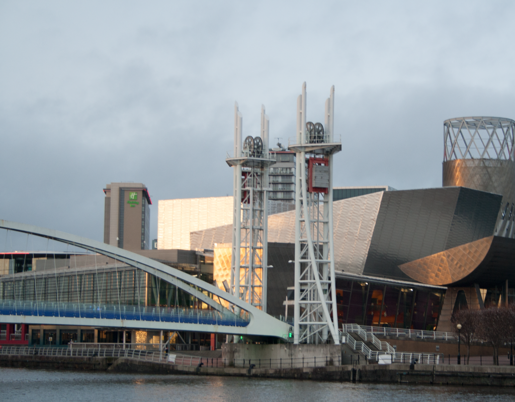
In this photo the light was working with us to create some amazing shadows and the sunset itself is beautiful. I turned up the temperature in the RAW image file to make it look even more brighter, giving it that warm feel. I also added a lens flare, due to the exaggeration of the bright light for added effect. To improve this photo edit I could of turned the oppacity down on the lens flare to make it as natrual as possible. We took this photo from Media City of The Imperial War Museum in Salford Quays meaning it’s a highly zoomed in shot. This lowers the quality slightly, as you can see the edges of buildings aren't as sharp, however this also party was because the camera should have been a bit more focused. I love have perfectly this image captures the sunlight.
As the sun started to set I used the light to my advantage as it created a shimmering flow on the buildings. My aim was to make these modern buildings look old fashioned by changing the colour and texture of the photo. To do this I turned the photo to colourized, turned the hue down to 25, turned the saturation down to 20 and adjusted the lightness accordingly. Now that the photo is the right colour I wanted to add the texture to it, to do this I duplicated the layer and drag and dropped an image of an old piece of paper. I then adjusted the size so that it matches up with the photo and turned down the opacity level to make it transparent. This photo was taken at Salford Quays of the Imperial War Museum. I think this photo looks pretty nice by itself without the need for editing it but I did anyway, therefore I think the only way I could improve this is to possibly take it from a different angle.
This photo was purposely taken out of focus to add bokeh. I played around with the colour in Photoshop to achieve this this look of a lot of the colours resulting in the opposite, give the photo a different atmosphere and therefore a whole different feel. There are a lot of blue in the edited image, this gives it a cold feel to it. The only thing, which doesn’t look realistic in the edited photo, is the publics abnormally blue faces. To improve this edit I could of adjusted the colouration in peoples faces by using the brush tool. There is a slight bit of white noise after I edited this photo as well, I could have took my time to remove it in order to make it more visually appealing. To improve the actual photo itself I could of kept the bokeh in the background but made sure the objects closer to the lens was in focus. This is taken just next to Piccadilly Gardens on the stairs of the tram stop.
I stood in front of a white backdrop in the college's photography studio, these shots also fall into the category of studio work photography. When we first took this photo it was over exposed as the white balance is too high, therefore we re-took it and the lighting was better this time. I aimed to give this photo a fresh and happy feel to it, hence my facial expression.
|
Archives
January 2017
Categories |


 RSS Feed
